

A studio in Manchester posts a midweight design role on a Monday. By Friday afternoon there are ninety applications, most of them a single link. Whoever opens yours is doing it between client calls, with a coffee going cold and a Slack thread demanding attention. Your portfolio has perhaps forty seconds to justify a longer look. That pressure shapes the choice between a visual-first portfolio and full case studies — and the right answer depends far less on taste than on who is holding the mouse.
Start with the reader, not the format
A visual portfolio is a sequence of images with minimal text. It answers one question fast: can this person make good things? A case study is a narrative — problem, constraints, decisions, outcome. It answers a different question: can this person do the work here, with our briefs, our clients and our deadlines, and explain themselves while doing it?
Neither format is inherently stronger. But they are not equally suited to every job, and most designers lose interviews by submitting the right work in the wrong shape.
What a visual-first portfolio does well
Craft studios hire on craft. A creative director scrolling a clean grid of twelve projects can judge typography, colour, spacing and consistency in under a minute, and that judgement is often accurate. If you are applying to a branding studio, an editorial team, a packaging house, a motion studio or an illustration agent, images should carry the weight.
To make that work, be disciplined:
- Eight to twelve projects, strongest first. Nobody scrolls to the bottom out of politeness.
- Consistent image widths. A jumping layout reads as carelessness, whatever the work is like.
- One line of context per project: client, sector, your role, and what happened as a result.
- Check it on a phone. A surprising share of first looks happen on a commute.
The risk here is anonymity. Without a sentence of context, your beautifully shot identity project looks like a hundred others, and the reader has no way to tell whether you led it or made the coffee.
Where deep case studies earn their keep
Case studies matter when the work is complicated, when the decisions were hard, or when the job involves being in a room defending those decisions. Service design, product, UX, campaign strategy, complex wayfinding — these need explanation. So do roles where you will present to clients or stakeholders regularly.
Good case studies are shorter than most designers think. One strong project write-up might run 600 to 800 words: the brief in a sentence, the constraint that made it difficult, your specific contribution, two or three decisions with the trade-offs you accepted, and what changed afterwards. The trap is process theatre — photographs of sticky notes and screenshots of wireframes prove that a workshop happened, not that you thought well. Replace every process image that does not illustrate a decision.
Three readers, three different expectations
Agency and studio roles
The first reader is usually a designer or creative director, and they are looking for craft and range under deadline. Lead with images, then add two or three case studies that show how you handle a brief and a brand you did not design. Show you can work inside constraints without sulking about them.
In-house roles
In-house hiring tends to be more cautious, with more people involved in the decision. Your reader may be a design lead, a marketing manager or a head of brand, and they will be asking whether you can work with stakeholders, respect existing guidelines and stay long enough to be worth training. Case studies with measurable outcomes — a launch, a conversion improvement, a system that reduced production time — do more work here than a beautiful grid.
Freelance and contract work
Clients want confidence and clarity. A short case study per project, plus a plain page on how you work — typical timelines, what you need from them, how you handle feedback — removes most of the anxiety that stops people enquiring. Three deep examples beat fifteen shallow ones.
The hybrid most designers should build
You do not have to choose. Give each project a landing view: a strong hero image, a two-sentence summary, your role stated clearly. Then let the reader expand into the full story on a second page or an expanding panel. The skimmer gets a route through in forty seconds; the interested reader gets the depth. What matters is that the two layers stay consistent, so nobody is surprised by what they find.
Every project page, whatever the format, should carry the same essentials: client and sector, your role and the size of the team, the brief in one sentence, one decision you would defend in an interview, and the result in plain language.
Five cuts that sharpen either format
- Process images with no accompanying decision.
- Projects you would not happily show a peer.
- Jargon — "holistic", "end-to-end", "360 campaign" — that hides what you actually did.
- Team ambiguity. If four people made it, say which parts were yours.
- Friction: passwords, autoplay reels, scroll-jacking, PDFs. Make it open in one click.
A practical way to decide
Ask three questions about the role you are applying for. Who reads first? What will they doubt about you? What is the fastest way to answer that doubt? If the doubt is craft, lead with images. If the doubt is judgement, lead with a case study. Then test it: send the link to a designer you trust and ask them to look for forty seconds, close the tab and tell you what they think you do. If their answer is vague, your format is failing before your work gets a chance.
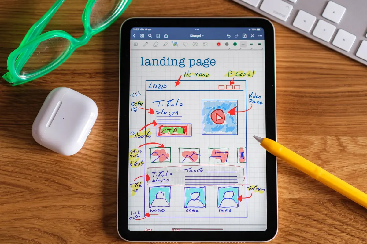
Photo: Davide Baraldi / Pexels