

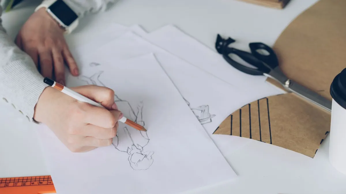
Illustration Portfolio Checklist: 15 Things Art Directors Look For
Art directors rarely read a portfolio from start to finish. They open a link between meetings, scroll quickly, and decide in a few seconds whether the work deserves a second look. That is not a judgement on your effort; it is how commissioning works when someone has a deadline and forty tabs open.
So the aim is not to impress with one heroic image. It is to make the skim easy, and to answer the question a commissioner is already asking: can this person hold a style, draw people convincingly, take a brief, and deliver files without a fuss? The fifteen checks below cover what comes up again and again, grouped so you can work through them in order.
1. Style consistency: give them one clear voice
Before anything else, an art director is working out what they would be buying. If your portfolio swings between loose ink sketches, flat vector scenes and painterly digital work, the answer is "anything", which usually reads as "not this".
Consistency is not repetition. You can draw a fox, a kitchen table and a crowd at a bus stop, as long as the line, colour and mood feel like they came from the same hand. Range of subject is welcome; range of personality is confusing. If one image looks like a soft pastel picture book spread and the next looks like a hard-edged cyberpunk poster, the art director cannot tell what they are commissioning. That does not mean you cannot do both. It means this portfolio should choose one voice, and the other work can live in a separate portfolio or a password-protected second edit.
A quick test: lay your best twelve images out as thumbnails, with no captions, and squint. One or two will jump out as belonging to a different portfolio. Those are the ones to cut or redraw.
Keep the edit tight
Most portfolios work well at ten to fifteen pieces. Fewer and there is not enough evidence; considerably more and your strongest work gets buried. If you have thirty good images, choose the fifteen that tell the clearest story and hold the rest back for a second edit you can send on request. A tight edit also makes the strongest piece feel stronger, because it has room to breathe instead of competing with three similar images on the same page.
2. Character work and emotional range
Character illustration sits behind a great many UK commissions: children's publishing, editorial, packaging, licensing, animation development. What gets checked, again and again:
- Can you draw the same character twice and have it read as the same person? A sheet of one character in six poses or six expressions answers that at a glance.
- Do your figures interact? Two characters in a scene is harder than one figure standing alone, and it is what campaigns and picture books need.
- Do your characters act? A face with an expression is fine; a body with a posture tells a story. Show someone reaching, hesitating, listening, mid-sneeze.
- Is there warmth or wit? Neutral, technically correct faces are easy to find.
The test is not only "can you draw a character?" It is "can you make me care about this character?" If all your character work is head-and-shoulders portraits, add at least one full-body sequence and one scene where two characters share space. A child hiding behind a curtain while an adult calls their name tells an art director more than ten perfect faces.
3. Editorial range: prove you can take a brief
Editorial commissioners are not only buying drawing. They are buying an idea, so two or three pieces should look like answers to a brief rather than personal projects.
If you have published work, use it and credit it accurately. If you do not, set your own briefs: pick an article you admire, read it properly, and make an image that clarifies or argues with it. Write the brief in the caption so the thinking is visible.
Then show you can handle the shapes a layout throws at you:
- a small spot illustration
- a vertical half-page
- a full-page image with room for type
- a cover or poster where the image has to do the heavy lifting
If your images only work at one size or one crop, commissioners will hesitate. They need to know you can compose for a square social asset, a wide banner and a spot that still reads at 3cm. You do not need to show every format, but you should show that format does not frighten you.
4. Composition and visual hierarchy
Art directors read images fast, so they need to know where to look first. A strong focal point, a clear silhouette, good value contrast and useful negative space do more work than extra detail. A busy market scene can be wonderful, but if a single yellow coat pulls the eye through the crowd, the image becomes usable for a cover or an editorial spread.
If everything shouts, nothing lands. Check your thumbnails: can you tell what the image is about at postage-stamp size? If not, the composition is probably too even, too crowded or too dependent on small rendering.
5. Drawing fundamentals: anatomy, perspective and light
Even highly stylised work needs underlying structure. Art directors may not say "your left hand is wrong" or "that table is floating", but they feel it. Hands, feet, eyes, perspective and consistent lighting are the quiet signals that you can be trusted with a complex scene.
Look for wonky furniture, figures that do not share the same vanishing point, and shadows that fall in three different directions. Life drawing is not only for realism. It gives stylised work weight, balance and believability.
6. Colour and texture
Colour is one of the fastest ways to show mood, and one of the quickest ways to look inconsistent. A cohesive palette does not mean every image uses the same five colours. It means your choices feel deliberate. Warm ochre and dusty blue might suggest nostalgia; acid green and black might suggest tension. Texture should support form, not hide it.
Check whether your colour choices change randomly between pieces. If one image is neon, the next is muted pastel and the next is high-contrast black and white, ask whether that variety is a style choice or simply a lack of direction.
7. Storytelling and narrative
Illustration is often asked to tell a story in one frame. Show a before and after, a cause and effect, or a character caught mid-decision. A dropped ice cream, a watching seagull and a child's horrified face can imply a whole afternoon without a single word.
If you want picture book or editorial work, include at least one sequence of three images. It proves you can pace a narrative, keep a character consistent and build a world across multiple spreads.
8. Technical file delivery and specs
An art director may love your work, but if the files are chaos, they will avoid commissioning you again. They are not expecting you to be a production artist, but they are expecting you to be low-friction.
- Files named clearly, for example client_project_illustration_v3.psd, not finalfinal2.psd.
- Correct resolution for print and screen.
- RGB for digital, CMYK for print, and spot colours where needed.
- Bleed and crop marks on print-ready PDFs.
- Transparent PNGs and layered files available on request.
- Fonts outlined or packaged if you have added type.
A simple line on your contact page can help: "Layered PSDs, CMYK PDFs and transparent PNGs available on request." It signals that you understand the job does not end when the drawing is finished.
9. Professional presentation and website
Your portfolio should be easy to open, easy to scroll and easy to contact. That means no autoplay music, no slow-loading 12MB images, no tiny thumbnails that require a click to see anything, and no hunting for your email address. If your portfolio is an Instagram feed with memes between illustrations, you are making the art director work too hard.
A simple website or well-made PDF is usually enough. Put your strongest, most representative image first. Use captions. Make sure it works on a phone. The best portfolio is not the most elaborate one; it is the one that makes the next step obvious.
10. Briefs and commissions: how you talk about work
Captions do a lot of quiet persuading. Include the client, the brief, your role and the date where possible. If a piece is personal, say so. If it was art directed, say who by. If you worked as part of a team, be precise about what you did.
Show process only when it adds something. One or two sketches beside a final image can prove you can take feedback and develop an idea. Twenty sketches of the same face usually just slow the scroll. Art directors want to see how you think, not how many hours you spent.
11. Range of formats and applications
Show that your work can live in the world. A book cover, a packaging design, a billboard crop, an app illustration or an animation still all place different demands on an image. One or two contextual mockups can help a commissioner imagine the work in use.
Do not overdo it. If every piece is presented on a tote bag or a coffee cup, the work starts to feel like a template. The illustration should still be the main event.
12. Reliability and communication signals
A portfolio cannot prove you will hit a deadline, but it can signal professionalism. A clear contact page, a note about availability, a short response time and accurate credits all suggest you are easy to work with. Testimonials and a "selected clients" list help, if they are true.
Art directors are not just hiring a drawing. They are hiring a working relationship.
If you have an agent, say so. If you do not, be clear about how you prefer to be contacted. Ambiguity creates friction, and friction is what makes someone close the tab.
13. Social proof and credits
Clients, awards, publications and exhibitions are useful because they lower the perceived risk. Use them accurately. Do not inflate a group project into a solo credit. If you have no commercial clients yet, self-initiated briefs are fine, as long as they are labelled honestly.
Strong personal work can be more persuasive than a weak published piece. The credit is not the point; the evidence is.
14. Consistency across platforms
Your website, Instagram, Behance and agent page should not tell different stories. If someone finds you through one link and then checks another, they should see the same style, the same strongest pieces and the same contact details. Old work at the top of a feed can make your current portfolio look out of date.
Check for broken links, old email addresses and images that no longer match the work you want to be hired for. A five-minute update can save a commission.
15. The final skim test
Before you send your portfolio, ask someone who is not you to skim it for ten seconds. Then ask:
- What style do you think this person works in?
- Which three images do you remember?
- Can you find their contact details?
- Does it work on a phone?
If the answers are vague, your portfolio is not ready. If they can name your style, remember your strongest pieces and contact you without scrolling back, you have done the job.
The five-minute pre-send audit
- Is the first image your strongest and most representative?
- Are there fewer than fifteen pieces?
- Do captions explain client, brief and role?
- Do all links and files work?
- Is your contact information one click away?
What to cut first
- Old work that no longer matches your style.
- Duplicate pieces that show the same skill.
- Work you cannot explain or credit.
- Very dark or very small images that are hard to read.
- Anything you would not want to be commissioned to make again.
A portfolio is not a museum of everything you have made. It is a focused argument for the work you want next. Cut the noise, keep the voice, and make the skim so easy that the art director has no reason to close the tab.
Photo: Vitaly Gariev / Pexels